
(https://www.facebook.com/note.php?note_id=469716398919)
This map is a visualization of the friendship between 500 million users of Facebook, created by Paul Butler, an intern on Facebook's data infrastructure engineering team. To create this visualization, Butler assigned a weight for each pair of major cities in the world based on the distance and number of friendships between the cities. Lines are then plotted between each pair of cities. The visibility of each line is based on the weight of its corresponding pair of cities, such that the cities with more friendships between them would be connected by a brighter line. What strikes me the most about this map is that one can clearly see the outlines of major continents as well as political borders when this map is not based on any additional geographical or political data. The lines also seem to reflect popular flight patterns of air planes. This suggests that most friendship are established locally while some via travel .
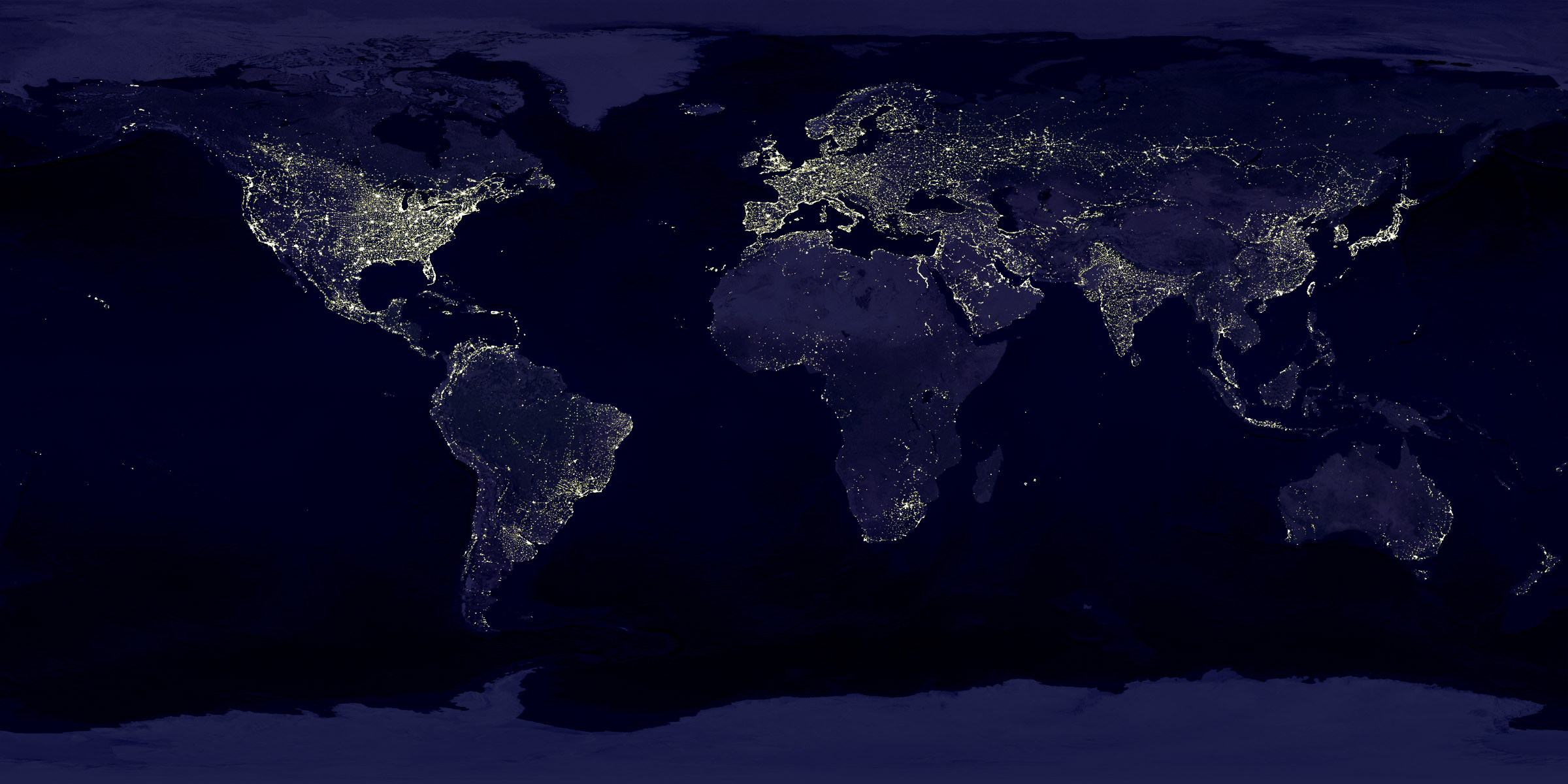
This image is a satellite photo taken by NASA showing Earth's city lights at night. Through this photo we can see an emerging pattern of urbanization such that cities develop from coastlines, water sources such as rivers, and major routes of transportation and trade. While it's no surprise to see blackouts in North Korea, Africa, Russia, and areas of China, I am surprised to see the majority of Canada covered in darkness. I've never been to Canada and have always pictured Canada to be as developed and urbanized as the United States. This assumption, however, has been completely refuted by this photo.

This image, titled "The True Size of Africa," was originally created by Kai Krause and published on The Economist. Most maps nowadays utilize the Mercator Projection, which maintains the shapes and areas of small lands but greatly distorts those of large lands far from the equator. Krause urged that under the influence of the popular Mercator Projection people nowadays have become geographically illiterate. In his image, Krause arranges countries from the Mercator Projection to fit an outline of Africa that has been enlarged to match its actual area. The result is quite shocking; Africa's area is larger than China, America, India, and Europe combined. It really took me a while to believe this image since I've always pictured Africa to be about the same size as South America. Only after seeing this picture did I realize that I am part of the population of "immappancy," or those without sufficient geographical knowledge.
Canada is every bit as developed and urbanized as the US, by population. It just has more land that is not suited to human habitation.
ReplyDelete